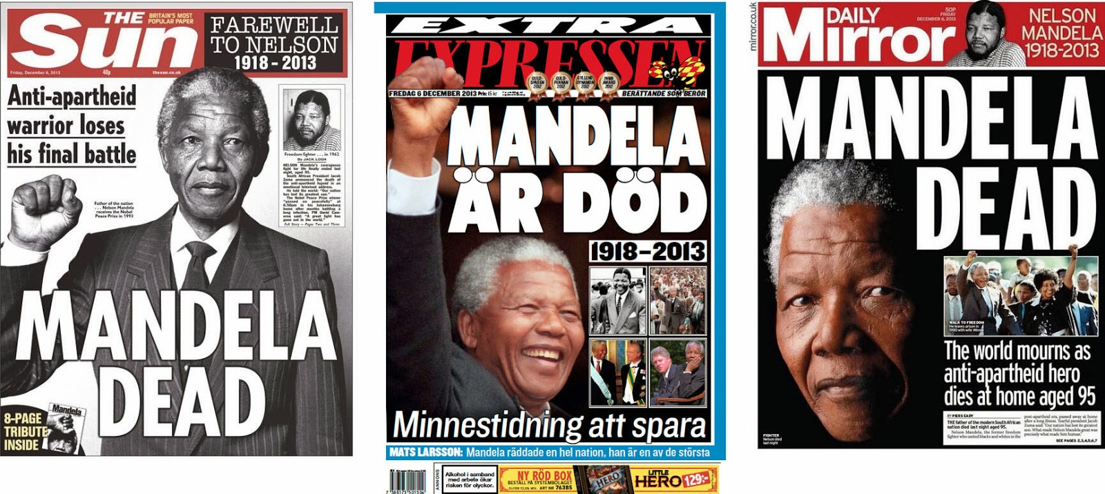
Except, some seemed to think their readers didn’t know. Examples like these were mainly to be found among the evening papers – the ”real” tabloids. Not sure if this says anything about any general presumptions that publications like these might have about their audience, but it IS kind of interesting, isn’t it?

WRITING THE HEADLINE must be the hardest part. When you’re the paper of Mandela’s home town, it must be even harder. I really admire the good spirit of the Sowetan’s straightforward approach: Sure, it’s sad that our hero has passed away – but what we ought to remember, and celebrate, is the joy and hope he brought to our lives.
And for some reason, the French language makes everything – even the flattest clichés – sound, and look, better.

A NUMBER OF PAPERS chose this simple solution: Find the right portrait of the man – and with such a flamboyant figure, there must have been plenty to choose from – and just put his name and year of birth & death next to it. With a little bit of additional text, or maybe not, the whole piece will look noble, exclusive, and respectful.

Even though the communicative process can indeed become more dynamic with a photo choice that is just a tad bolder. Or a lot bolder. See how the third example, from Público of Lisbon, Portugal, suddenly adds one more dimension to the whole story and exploits the fact that Nelson Mandela’s facial features were engraved in our minds long ago. We all know what his face looked like, so here’s his fist.

FINALLY, THREE PAPERS – all from London, England – that took their frontpage one step further. The Independent chose a no-headline solution; Mandela’s face, and his words on freedom, say it all (in its later edition, The Guardian took a similar approach). The Times expanded its frontpage into a full cover and made intelligent use of the tricky format.
But the boldest move was the one of Metro – a freesheet which you might have expected to deliver its message as crudely and in-your-face as the traditional tabloids. Not only did the editor refrain entirely from adding words to Mandela’s portrait but the entire frontpage, including the nameplate (usually blue), had turned black-and-white. A symbolism which becomes so much stronger than in the previous B&W examples because no words are here to distract my attention.
Ingen kommentarer:
Send en kommentar